Thing 14: Posters and Infographics

Looking for a succinct yet impactful way to showcase your research project? In this post we’ll get you started with creating effective posters and infographics.
Basic principles
Posters are visual tools that can effectively summarise a complex research project. The effectiveness of the poster depends on how quickly and easily audiences can read and interpret it, so it should be visually prominent. When creating a poster it is important to present research findings in a way that is easy for viewers to understand. Visual design elements like shapes, colours and images can successfully communicate complex information in a succinct manner and can greatly improve understanding of the research project.
How to showcase a research project as a poster
Assemble your data
What is your story? What are your findings? Try to minimise textual information as much as you can. Use strong verbs and active voice and avoid complex and unnecessary words. You will need to decide on a small number of key points that you want your viewers to take away from your poster, and you will need to articulate those ideas clearly and concisely.
Plan your narrative
Consider grouping related text and data together with a border, so your reader can more easily digest bits of information. Make your findings obvious.
Plan data visualisations
Layout is not only defined by how elements such images, graphs and text are distributed on the poster, it also relates to colour scheme and information architecture. A poster with repeated visual elements will look and feel cohesive, while one with new elements on each corner will look and feel disorganised and chaotic. When creating a poster, aim for 20% text, 40% graphics and 40% white space when establishing the overall content. Whenever possible, use an image or graphic to portray information rather than a paragraph or text. Text, graphs and images should be evenly dispersed in the poster. Make sure there is a lot of separation between sections. White space can provide room to rest the eyes and it is very effective in helping viewers to focus on what is important. Also, think of applying symmetry when connecting different elements and sections in order to achieve balance and a sense of stability. If elements are unified together they support harmony in a design.
Consider the flow of information
Determine a logical sequence for your story and show this sequence in your headings. Decide how your viewer will follow the direction of your narrative and guide them with arrows or numbering to move from one logical step to another. Consider using directional icons or numbering to help them navigate your presentation. Important points are easily emphasised with headings, bold text and bullet points.
Colours, fonts, images and graphs
Colour: Colour creates moods, and the way colours are combined is very important. Avoid dark backgrounds and stick to a theme with a maximum of three colours. The goal is to cause recognition in the navigation of a poster, not to introduce chaos.
Fonts: Sans serif fonts are usually considered the most readable for text to be displayed on a screen. Choose a font set and be consistent; you can use different weights and sizes for different text elements. The following are some general rules on typography for websites:
- Avoid using different fonts, sizes and style
- Choose a sans-serif font (like Helvetica or Verdana), not a serif font (e.g. Times New Roman)
- Avoid underlining words and capitalisation
- Text should be left-aligned.
Images and graphs: Images and graphs are effective elements and they should be used wherever possible instead of harder-to-read tables, or paragraphs of text. Make sure to give your graphs and charts clear and concise titles that give your reader direction.
Create
Powerpoint, Canva and Piktochart are a great way to convey information in a visual effective way. Canva and Piktochart have flexible free versions; they both offer similar features including free templates, a range of icons and graphics, drag and drop elements, custom sizes and download or embed options.
In summary
- Plan your story before you start
- Know what you want to communicate
- Arrange elements in a logical flow
- Colours/fonts/images/graphs
- Reference your sources
Try This
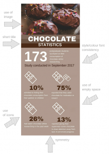
Create a simple poster using the following information:
- 173 postgraduate students were surveyed on their consumption of chocolate whilst researching
- Study conducted July 2016
- 10% admitted to hiding their chocolate consumption from their partner or children
- 75% reported that they used chocolate for motivation or reward
- 86% had eaten chocolate whilst researching in the past week
- 13% reported giving their supervisor some chocolate to draw attention away from lack of perceived progress
Not sure where to start? Here’s an idea for an infographic incorporating the information listed above:
 Learn More

- Canva, besides offering free software, has a range of useful support materials such as the Canva design tips and the Canva design school blog.
- For font inspiration head over to I Love Typography.
- Struggling with colour? Check out Design Seeds for gorgeous colour palettes.
This post was written by Tanja Ivacic-Ramljak (Liaison Librarian (Learning & Teaching) – Faculty of Veterinary and Agricultural Sciences), who also created the infographics for this post.
Categories
Leave a Reply