Research through Making: Resources from our workshop
See below for post workshop resources!
Title: Workshop on making a data visualisation or information design for humanities and social sciences research
When: Thursday, 24 February 2022, 11:00 AM – 12:30 PM AEDT
Monday 29 Sept 2022, 11:30AM-1:00 PM AEDT
Speaker: Amanda Belton & Geordie Zhang, Melbourne Data Analytics Platform
Format: Hybrid Workshop via Zoom and Face to Face at Arts West
Abstract: In this workshop you will make a data visualisation or information design about your research. We will draw from understandings of action research the five design-sheet methodology with these activities structured as short iterations through the workshop.
+++++++Workshop resources+++++++
In this workshop you will make a data visualisation or information design about your research. We will draw from understandings of action research the five design-sheet methodology with these activities structured as short iterations through the workshop.
David McCandless visualises what makes a good visualisation in his book ‘Knowledge is Beautful’

If we drill down into the role that metaphor plays in a good visualisation we can learn from Jane Hirshfield’s exploration of ways metaphors help us better understand the world
We understand our world through stories and yet it can be hard to think of some of our research as a story.
Here Leonardo Da Vinci’s Virtruvian man shows us how diagramatic visualisations can be dense displays of mathematical information that can be processed with a macro and a micro reading:
This inspired the design of the opening credits of the tv show Star Trek Discovery. The concepts of scientific precision and the forms of artful representation can be drawn into a story. This 3d design of architectural style drawings are rendered as a 2d linear narrative telling the story of the series in a short timeframe:
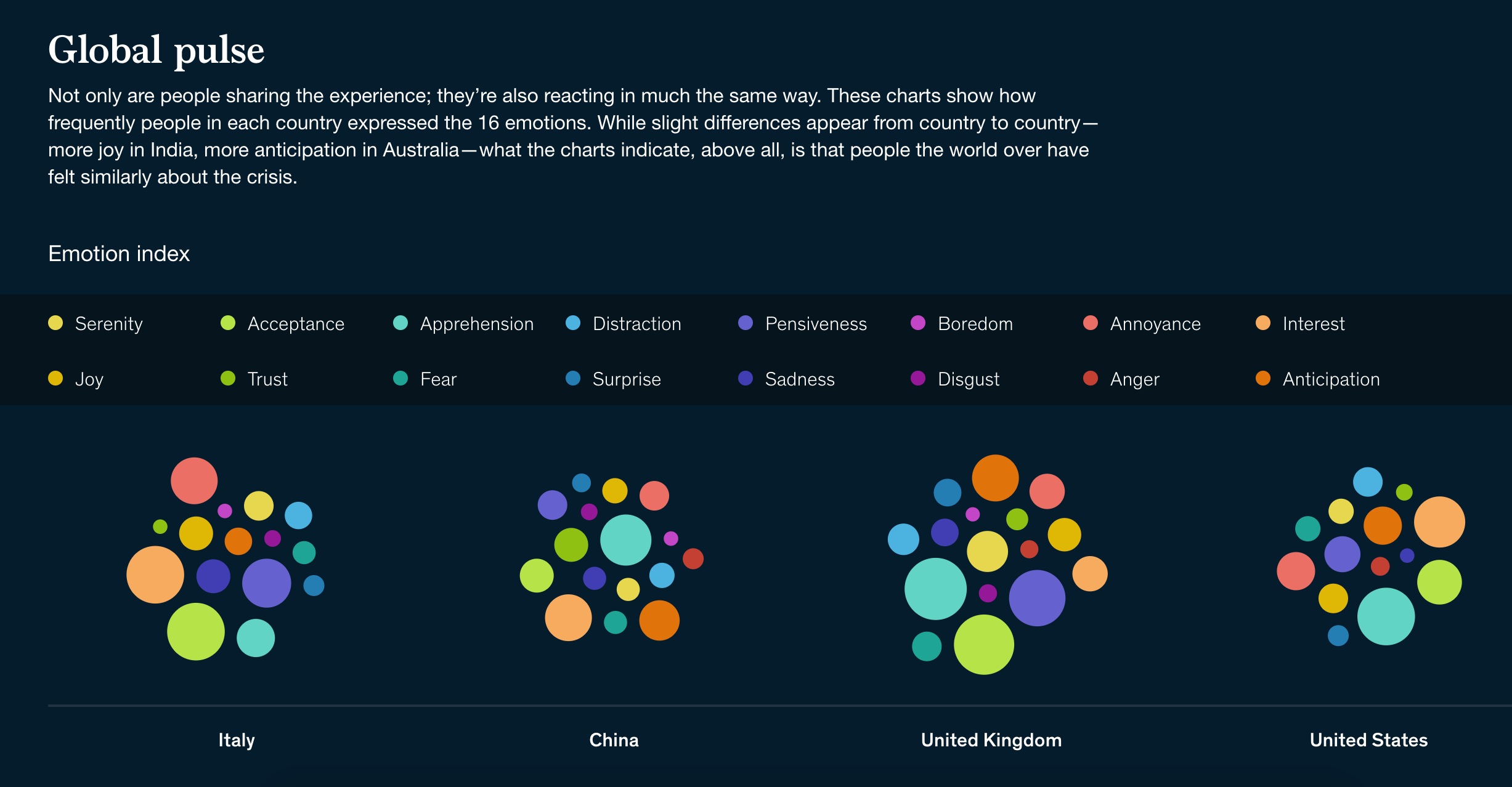
This McKinsey visualisation of the reflections of 122 people across eight countries uses colour and shape to represent this data.

The colour palette from Plutchik’s wheel of emotion helps us read this visualisation using colour as the key to the derived attribute of emotion.
This collaboration with education researcher, Carmel Mesiti, led us to create short form looping animations of individual text terms to realise the goal to invite viewers into the longer form of the book publication. This visualisation design started with the textile design by Erja Hirvi for the Marimekko design house and over iterations took its final form as discussed
in our zoom chat:
We also played with an exploratory visualisation of the terms as blossoms on a wattle tree, building on the visual metaphor of a tree of knowledge and extending the use of the flora as flag signifying the language for each researchers’ contribution to this international
project. This particular iteration of the collaboration left this interactive D3 visualisation as an experiment that informed further iterations of the looping animations of individual terms.
This map of Ise shrine in Japan uses the distinctive shapes of the Japanese mountains to give us a functional understanding of where we stand. The overlay of the Japanese train systems helps the viewer find their access points for getting to the shrine and heading away to our next destination. The viewpoint is different to the traditional top looking down view of most geo-spatial representations, but its a viewpoint that makes sense of the view we see on the ground in Japan’s mountainous topograhy.

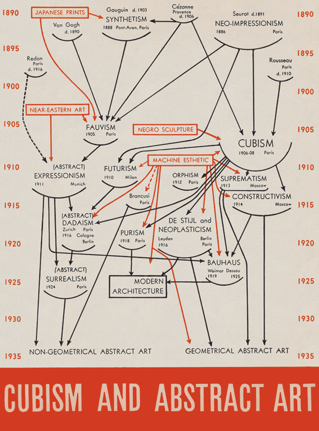
Barr’s diagram of Cubism and Abstract Art uses spatial layout, an clearly labeled timescale on the y axis and arrows to represent the type of relationship. This visualisation encodes the authors understanding of the interrelationship and lineage of art movements, an external representation of their cognition that helps us learn from them. You can read of Edward Tufte’s analysis. 
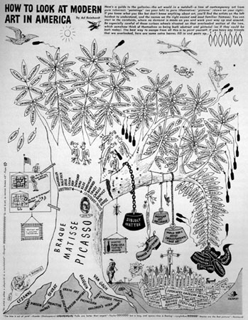
It makes an interesting comparison with the dense representation of Rienhart’s Diagram of Modern Art. I encourage you to read more about these two posters as information visualisation in Tufte’s book ‘Beautiful Evidence’.

Robert Janezic has used Tableau to create a diagram of parallel flows showing music genre popularity over time.We can see use of the metaphor of the ebb and flow of the ocean, the visual form including colour and shape to encode the data. What do you think is the goal of this visualisation?
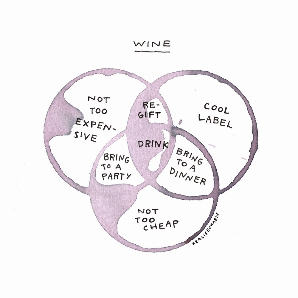
Lastly, let’s take a look at a physical representation, translated into a digital form for annotation from illustrator, Michelle Rial:

Thanks so much to my fabulous fellow experimenters in this interactive approach to understanding visualisation design principles.
If you’d like to chat more about visualisation design and brainstorm how this could apply to your research project, please visit our contact page.
HADES Seminar Series: Humanities in the Digital Age
From the Humanities and Diverse eResearch Scholars group (HADES), this series brings together a wide range of interdisciplinary research at the intersection of Humanities and digital scholarship. We will hear from speakers on topics ranging from digital ethics and machine learning through to architecture and literary studies, but always with a focus on the crucial role that the Humanities play in helping to explain and shape complex human experiences. The series aims to challenge and extend understandings of digital research in the Humanities and present new and emerging work by scholars working across and between disciplines.
Seminars will usually be held monthly on the third Thursday of every month at 3:30pm.
About your facilitator, Amanda Belton
Amanda is a data scientist working with education and arts researchers to visualise data. She works with playful approaches and empathetic design principles to communicate research data visually, into the digital realm. Her work uses animation admixed reality in accessible information designs.
Categories