Reporting Two-way interactions
An example
Here we consider reporting an analysis involving a two-way interaction, using with the example of Crampton’s (1947) study of the effects of dose and method of delivery of vitamin C on the development of teeth in guinea pigs. You can read about the background of the study here on the post about understanding two-way interactions. As a reminder, the plot of means is reproduced here:
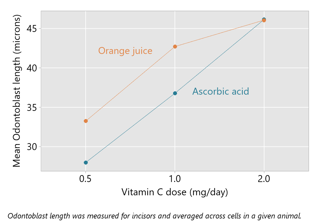
The outcome is Odontoblast length (microns) and there are two explanatory factors — dose of vitamin C and method of delivery.
The analysis of these data discussed here uses a non-additive model — a model including an interaction. An appropriate report of the analysis may include summary statistics, the estimated interaction effects with 95% confidence intervals, and P-values. The interaction P-value is for a test of the null hypothesis of no effect moderation or no interaction: the effect of one of the factors (method of delivery) is the same at each level of the other factor (dose). The analysis for the non-additive model also will provide so-called tests of the main effects, with P-values; the corresponding null hypothesis is, for any factor, that there is no difference between true means for different levels of the factor. In the non-additive model, these tests are carried out in the presence of the interaction; this means that they are generally not the focus of interpretation.
The analysis of these data, with the methods illustrated here, assumes that: the observations are independent, the random errors arise from a Normal distribution, and the variance of the random errors is constant. A good analysis involves assessment of these assumptions, including examination of residual plots, and this may be discussed in a description of the statistical methods used or in the reporting of the results.
Here is an example of a summary table that provides descriptive statistics.
Table 1: Summary statistics for Odontoblast length (microns) by Method of delivery and Dose (mg/day)

The hypothesis tests results can be summarised as follows:
Table 2: Statistical tests from a two-way Anova model of Odontoblast length (microns)
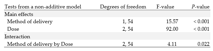
Consistent with the pattern of means in the plot, the P-value for the test of the interaction is small.
The next aspect of reporting focuses on interpretation of the interaction effect. The plot of means, as provided above, is often used as an aid to understanding the interaction. This shows little effect of method of delivery when the dose is 2 mg/day, but mean differences with higher mean odontoblast lengths for orange juice when the dose is 0.5 or 1.0 mg/day.
The interaction effects can be quantified, for example, by estimating pairwise mean differences for levels of one factor for each level of the other factor. How best to do this can depend on the factors in the analysis and how many levels they have. In this example, pairwise comparisons of the method of delivery for each dose are suitable; this corresponds to a natural interpretation of the plot of means given above.
The table below provides the estimates of the difference of means (Orange juice minus Ascorbic acid) for each dose; 95% confidence intervals quantify the precision of these estimates. The P-values correspond to tests of the null hypotheses of no effect of method of delivery at each dose level.
Table 3: Pairwise comparisons of mean Odontoblast length (microns) according to Method of delivery for each level of dose

It can be helpful to plot the pairwise comparisons above, as shown in the next plot.

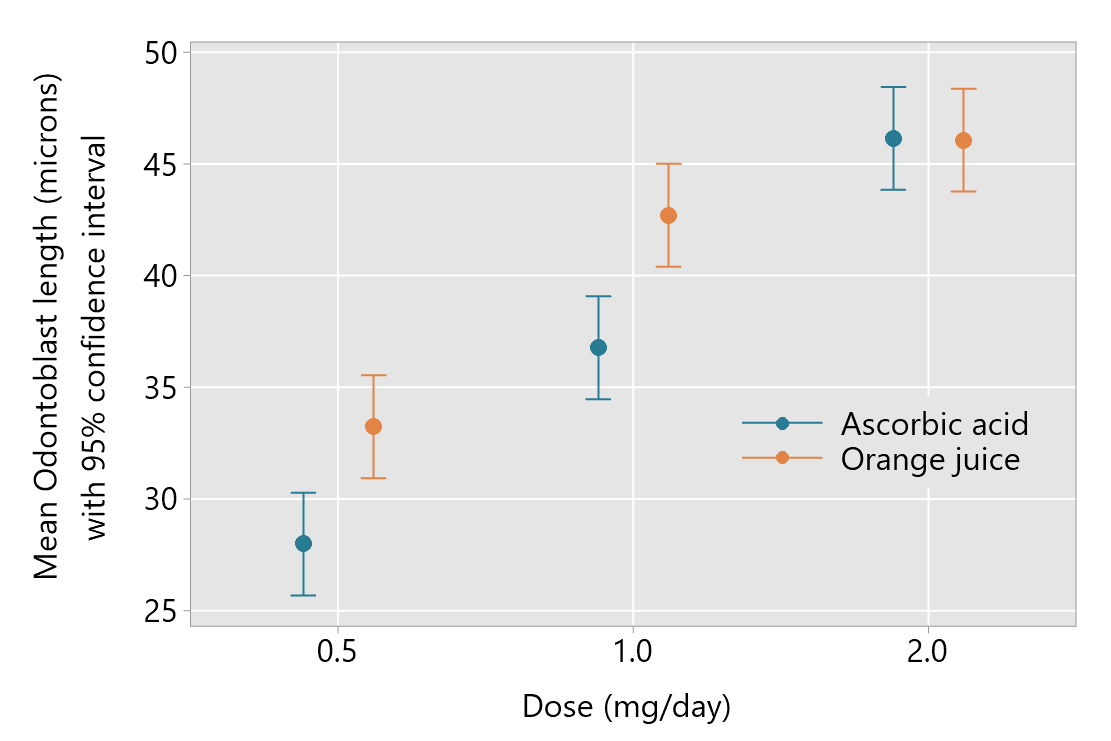
In some cases, it may also be useful to obtained the estimates and confidence intervals from the model, and to plot these, like the example below. This may be the case if there are many levels of one or both of the factors involved.
Software
In the examples of output for the statistical modelling from statistical software provided below, the variables are named as follows:
- Outcome: Odontoblast length (microns)
- Explanatory variables: Delivery, Dose
The examples below assume some familiarity with the software you are using.
Minitab 19
The output from fitting a General Linear Model in Minitab is shown below, with the information used to construct Table 2 highlighted in red.

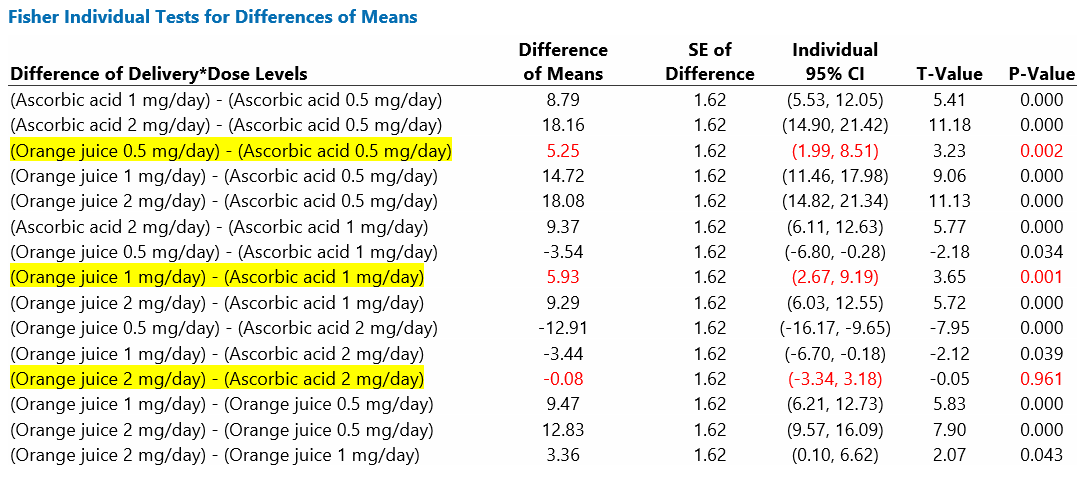
The pairwise comparisons, shown in Table 3, are a subset of Fisher intervals highlighted in the output below. These are intervals for the interaction term; Fisher intervals are unadjusted for multiple comparisons. The output includes all possible pairwise comparisons (15 in total), but only three are of interest here.
Minitab’s four-in-one residual plots should be examined to allow consideration of the assumptions about the random errors.
R
The code and output from R for obtaining the information summarised in Table 2 is shown below. The joint-tests() function from the emmeans package has been used to obtain the ANOVA table.

The emmeans package is also useful for obtaining pairwise comparisons. Code and output for obtaining comparisons of delivery methods for each level of dose are shown below. Note that these comparisons are for Ascorbic acid minus Orange juice. The default comparisons will be reversed compared with the results in Table 3. However, inclusion of the code reverse = TRUE will reverse the default order.

An plot of the predicted means with 95% confidence intervals, can be obtained with the code shown below.
![]()
The basic plot provided is shown here; you can make improvements with adjustment to the code.

R can provide residual plots relevant to assessing the model assumptions via the plot() syntax.