The Branding Pearl Contained in Shell’s Logo
Laura Gomez Aurioles
Have you ever wondered, what does a Pecten-Scallop shell has to do with a petroleum corporation? Being the logo – the most relevant semiotic intermediary for meaning within a company’s visual and verbal promotion strategies – the origins of Royal Dutch Shell’s yellow and red mollusk tell us a story of branding and advertising success.
The Pecten, chosen as the logo in 1904, reflects the maritime activities and areas where Shell corporation was highly active. Its founder, Marcus Samuel—who used to ship oil to the Far East—found the shell as a symbol for containing a treasure, a fine and unique pearl. Consequently, this peculiar logo conveys that oil (or kerosene or petroleum) is as precious as a pearl preserved in a shell. Besides, shells are anywhere on the planet; therefore, this icon communicates that oil can be delivered to any location of the world. It is interesting to know that the company has over 500 shells in its archive and that many of them have helped it name its products. For example, Helix Lucorum gave origin to their high-performance Helix Ultra car oil range; while Rimula Marei and Microgaza Rotella inspired Rimula and Rotella heavy-duty diesel engine oils.
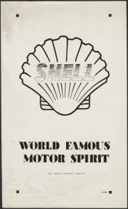
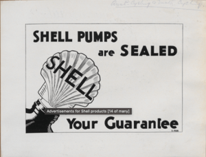
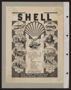
We may also find some early examples of how the shape of a Scallop was used in regular advertisements of the oil giant. In figure 1, we can see it with the company’s name inside the shell and featuring the product as a spirit, possibly referring to it as the finest drink for a motor; figure 2 shows a Scallop sealing securely the precious oil (just as a pearl), and in figure 3 we can appreciate all the different industries related to Shell inside the logo’s shape.


Following this line, Shell was one of the first oil companies to realize that it had to build up brand loyalty through embracing nature and preserving it. This began in England in the 1930s, where poster exhibitions such as See Britain First or Countryside invited the public to explore the world, powered by Shell. “Holidays or long-service leave are the ideal opportunity to discover such attractions—and there’s no better way to do it than in the leisurely comfort of your own car”, was the closing phrase of a similar campaign launched in Australia between 1948 and 1955. Illustrated by the Australian war artist R. Malcolm Warner, Discover Australia with Shell featured a collection of educational touristic posters on Australian flora and fauna.
Made with Visme
From a total of twenty-two posters, twelve were dedicated to wildflowers, three to birds, and seven to shells and other similar underwater creatures, of course! The latter focused on Victoria, Tasmania, New South Wales, and diverse areas of Queensland, which gathered about 50 percent of the sea life shown in the collection. You may learn about 124 different species by looking at these colorful posters, where the Scallop (Shell’s symbol) is found in all the mentioned regions but Tasmania. Interestingly enough, this shell and the Paper Nautilus are the ones featured the most. Was Shell trying to indirectly reinforce the message that they are everywhere? Find the answer to this question by exploring an interactive map (figure 5) showcasing all the beautiful posters of this collection!
Just as the more than 10 transformations that its logo has undergone throughout the last century, Shell has kept innovating in its advertisement strategies, which adapt to the needs and trends of society. One may explore part of this legacy at The Shell Heritage Art Collection, which is one of the most renowned commercial art collections, including work by Paul Nash, Graham Sutherland, and Vanessa Bell. From inviting artists to create its ads to educating the general public on issues such as emergency situations and vehicle safety, the Dutch company keeps connecting to its consumers effectively time after time!
Laura Gómez Aurioles is a Ph.D. student in the School of Culture and Communication at the University of Melbourne. As a member of the Creative Writing department, her research aims to find the correct narrative techniques to create a virtual reality time capsule to preserve Intangible Cultural Heritage stories.
References
Hewitt, J. (1992). The “Nature” and “Art” of Shell Advertising in the Early 1930s. Journal of Design History, 5(2), 121–139. http://www.jstor.org/stable/1315823
Matusitz, J., & Cowin, E. (2014). An Evolutionary Examination of the Royal Dutch Shell Logo. Journal of Creative Communications, 9(2), 93–105. doi:10.1177/0973258614528607
Robinson, M. (2014). Marketing Big Oil: Brand Lessons from the World’s Largest Companies. Palgrave Macmillan, New York. doi:10.1057/9781137388070
Quad Royal. (2015, June 22).You can be sure of Australia.
Shell. (n.d.). Brand History.
Shell. (n.d.). Did you Know.
Leave a Reply