The many stories of the Commercial Travellers Association

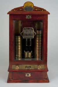
W.H. Ell's 'Safechek' sovereign changer c. 1907 Commercial Travellers' Association of Australia 1979.0162
W.H. Ell’s ‘Safechek’ sovereign changer c. 1907 Commercial Travellers’ Association of Australia 1979.0162

The Commercial Travellers Association of Australia (CTA) represents a professional organisation of otherwise previously unrepresented workers – a white collar union for travelling salesmen – that experienced a long decline as the economy evolved and steadily made them redundant. As such, the CTA’s interests were in providing services and supports to their membership such as insurance, supera

nnuation, educational opportunities, negotiating deals with hotels to support the commercial travellers’ work, providing display rooms for goods, a place for the commercial travellers to meet and socialise both together and with customers in the CTA Clubs.

It was initially a large and active body, conducting annual conferences and publishing a monthly magazine (The Australian Traveller), with an annual supplement (Australia Today). It had active branches in every State and especially prior to the Depression, was filled with that 19th Century ethos of civic duty and public good and the idea that the CTA was helping to create a bigger and better nation. After the Second WW, the economic changes occurring in Australia steadily began to wear the CTA down and much of the later years (60s-70s) were dominated by its declining finances and membership. Despite the problems of the later years, the CTA still tried to promote Australia and Australian achievements and never lost that pride in the nation building role that they saw for themselves.

The CTA collection, documents the rise and fall of the association over 100 years and includes the iconic original artwork of the flagship publication Australia Today by artists such as Norman Lindsay, Napier Waller, Lionel Lindsay and C Dudley Wood. The collection includes a rare sovereign changer. Once prolific in bars, and like establishments the ‘Safechek’ gold changer provided a canister of change in exchange for a sovereign or a half sovereign when it was inserted in the appropriate slot.

Contributor: Carl Temple

Source: Primary Sources: 50 Stories from 50 Years of Archives

Links

Commercial Travellers Association


Professor L.F. Giblin’s view of the Australian trade policy during the interwar years

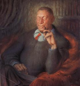
Portrait of Professor Lyndhurst Falkiner Giblin, UMA/1/1026, University of Melbourne Archives

The Giblin collection reveals Professor L.F. Giblin’s practical view of the Australian economy, challenging set approaches to empire. Recognising Australia’s interests and unique economic circumstances, Professor Giblin argued for greater responsibility in dealing with unemployment and falling trade during the Great Depression. He also called for greater self-sufficiency to develop a war-ready economy, broadening trade relations within and beyond the Commonwealth. Giblin’s view of the Australian economy did not overturn relations with the British Empire, but questioned how set approaches could be changed to meet distinctly Australian interests.

Madeleine Thorburn, School of Historical and Philosophical Studies has prepared an essay for her Capstone subject Making History that focuses on the interwar years. She considers the Giblin archive to be a significant primary source for scholars who wish to research the effect of events like the Great Depression and war on Australia’s relationship with the Empire.

University of Melbourne Archives links to collections:

1992.0142 Lyndhurst Falkiner Giblin

1983.0090 James Davies

Contributor: Madeleine Thorburn


Strange Scenes Identified in the Baillieu Library Print Collection

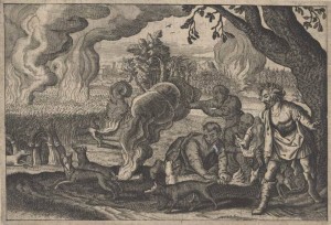
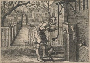
‘Unidentified. Series of twenty seven engravings from a book/ copper engravings – Dutch – ? 1650-1700 good impressions.’ This is what Dr Orde Poynton wrote in his registration book in 1960 for his print collection about a group of illustrations that subsequently remained a mystery. The key to unlocking the identity of the images lies in their peculiar subject matter. One of the most startling of the illustrations shows a scene of men attaching tapers to foxes’ tails and setting them on fire in order to burn a wheat field. What has this to do with other pictures in the series such as a man with his tongue stuck to the handle of a water pump?

Embelmata XV: How, Christian, are you now thus divided? (Hoe zijt ghy Christ, nu dus gesplitst?) (1624); Baillieu Library Print Collection, the University of Melbourne. Gift of Dr J. Orde Poynton 1959.
Embelmata XV: How, Christian, are you now thus divided? (Hoe zijt ghy Christ, nu dus gesplitst?) (1624); Baillieu Library Print Collection, the University of Melbourne. Gift of Dr J.
Orde Poynton 1959.
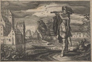
Embelmata L: De keur-wijz' leert van't gheen hem zeert (1624); Baillieu Library Print Collection, the University of Melbourne. Gift of Dr J. Orde Poynton 1959.
Embelmata L: De keur-wijz’ leert van’t gheen hem zeert (1624); Baillieu Library Print Collection, the
University of Melbourne. Gift of Dr J. Orde Poynton 1959.

Once the scenes were recognised as emblems, identification of their source revealed they were some of the 51 illustrations from Johannes de Brune’s Emblemata of Zinne-werck first published in 1624.[1] Emblems exist throughout art history, but as a genre they appeared in the 16th-century and seem to have fallen out of usage during the 19th-century. The earliest or most influential emblem book is Andrea Alciato’s Emblemata (1531). A copy of this popular book was donated to the university library in 1903 as part of the George McArthur Bequest. Unfortunately, the library does not hold a copy of de Brune’s work on emblems.

An emblem comprises three components, including a title or motto which sits above the image and a verse or epigram which sits below. Typically their design conveyed inculcating wisdom to their audience. They have been described as word-eye pictures as the two elements are required to interpret their riddle-like qualities. Yet their meaning can often remain elusive, and in the case of the Baillieu’s engravings, without the words, they have the unintentional effect of not making any sense. Indeed, de Brune wrote in the dedication to his book that without the explanatory text, the images would be as helpless as oysters without shells.[2] Emblems are similar to fable stories and their subjects can range from scenes of everyday life through to the fantastic; a guiding hand can reach out of the sky to direct the action, or an enchanted animal can be a protagonist.

Emblemata XI: De mensch vint baet, in anders quaed (1624)
Emblemata XI: De mensch vint baet, in anders quaed (1624); Baillieu Library Print Collection, the University of Melbourne, Gift of Dr J. Orde Poynton 1959.

In an example from Alciato’s Emblemata, a translation from the Latin motto is: ‘Intelligence matters, not beauty’ and the prose below the image describes:

A fox, entering the store-room of a theatrical producer, found an actor’s mask, skilfully shaped, so finely fashioned that the spirit alone was missing, in all else it seemed alive. Taking it up, the fox addressed it – What a head is this, but it has no brain![3]

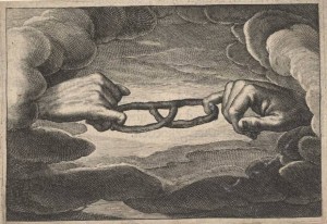
The illustrations in de Brune’s Emblemata are after drawings by Adriaen van de Venne, a leading emblem artist. As a text prepared during the Dutch Protestant Reformation, many of the images convey religious analogies through scenes of contemporary life. In one of the emblems the text explains God and the Devil’s battle for the soul, which is represented by two hands in the clouds finger-wrestling a pretzel.

Emblemata XIX: Des mensches leven is een strijd, Die noyt als met den mensch' en sijt (1624); Baillieu Library Print Collection, the University of Melbourne. Gift of Dr J. Orde Poynton 1959.
Emblemata XIX: Des mensches leven is een strijd, Die noyt als met den mensch’ en sijt (1624); Baillieu Library Print Collection, the University of Melbourne. Gift of Dr J.
Orde Poynton 1959.

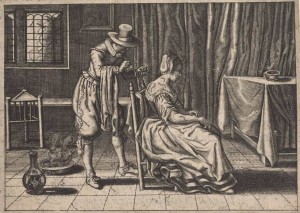
While other images have caught the attention of scholars for their social history such as the depiction of the medical practice of leeching in one image, and Dutch manufacture of early telescopes in another.  The illustration with the foxes refers to the biblical story of Samson torching the fields of the Philistines.[4] Although all of the translations are yet to be found, and the relative wisdom, or lack thereof, to setting foxes’ tails on fire and licking handles cannot be fully defined, it has been important to provide these images with some much needed context.

Emblemata XLVII: Jealousy finds pleasure in another's misfortune (De Nijd vind baet in anders quaed) (1624); Baillieu Library Print Collection, the University of Melbourne. Gift of Dr J. Orde Poynton 1959.
Emblemata XLVII: Jealousy finds pleasure in another’s misfortune (De Nijd vind baet in anders quaed) (1624);  Baillieu Library Print Collection, the University of Melbourne. Gift of Dr J. Orde Poynton 1959.

Kerrianne Stone (Special Collections Curatorial Assistant (Prints))


[1]  For a more detailed description of the book see Marleen van der Weij, “‘A Good Man, Burgher and Christian’: the intended reader in Johan de Brune’s Emblemata,’ in Alison Adams, Marleen van der Weij, Emblems of the Low Countries: Book Historical Perspective (Glasgow: Glasgow Emblem Studies, 2003), pp. 111-128.

[2] Els Stronks, Negotiating Differences: Word, Image and Religion in the Dutch Republic (Leiden: Brill, 2011), p. 77.

[3] Emblemata: Lyons, 1550  Andrea Alciato; translated and annotated by Betty I. Knott; with an introduction by John Manning (Aldershot, Hants., England: Scolar Press, 1996),  p. 203.

[4] P.J. Meertens, introduction to Emblemata of zinne-werck (Soest, Germany: Davaco, 1970), p. 4.


A Tale of Two Heritages

Shane Talia is a recent graduate of the Master of Cultural Heritage program at Deakin University. From October 2013 to March 2014, he completed an internship as an Archival Documentation Project Officer at UMA. This placement formed part of the University’s 2013 Cultural Collections Projects Program. 

The values, ideologies and ambitions of a corporation are generally legible through the tools it adopts to articulate its real, envisaged or desired ‘essence’[1]. The most widely identifiable means of expressing this ‘essence’, apart from the name of the corporation itself, is through strategic visual and symbolic means, i.e. the design and function of logos, crests, coats of arms or flags. These visual tools serve as integrated markers for a definable corporate cultural identity, unifying messages about this identity to key, but sometimes disparate, stakeholders. Likewise, they build consumer trust towards a corporate brand; reinforce a specific set of values; and just as significantly, nurture said brand’s reputation and recognisability[2]. Where identity-building and cultural meaning-making are concerned, visual semiotics theory accepts the equally instrumental role played between, for instance, a workplace uniform’s colour scheme, and the imagery developed for a corporate advertising campaign. Therefore, to convey these shared values and identity attributes consistently, these visual elements should synergise to establish a coherent ‘corporate identity structure’ for an organisation[3].

So how does a corporate entity reconcile this objective of narrative coherence with evolving values and identities over the period of 130 years, especially where significant organisational diversification or change has occurred? And how do emerging trends associated with the broader socio-cultural and political context within which an organisation is embedded harmonise with such significant events? The findings of my internship project at UMA on the National Mutual Life Association of Australasia’s (NMLA) collections uncover this interplay between cultural contexts and two distinct corporate histories, within the historical framework of its merger with another life assurance mutual society. In this placement, I provenanced, inventoried and documented a series of almost 220 objects that belonged to NMLA during its 130 years of operation[4], including office machines, portraits, and most relevant to this article, flags, plaques and ephemera bearing the company’s changing logos.

NMLA enamel wall plaque
NMLA enamel wall plaque, no date. University of Melbourne Archives, National Mutual Life Association of Australasia objects collection, 2013.0112.0051

One of the oldest objects in the collection is a crest plate on a wooden backing (reference 2013.0112.0051). The lower segment of the plate features the lion and unicorn of the Royal Coat of Arms, the enclosing garter ‘Dieu et Mon Droit’ (God and my right), and the accompanying Latin inscription ‘Quis Separabit’ (Who shall separate us?); a motto adopted by the Most Illustrious Order of Saint Patrick in 1783[5]. The Royal Coat of Arms has assumed several forms during Britain’s monarchical history, but NMLA’s version aligns with that of the Hanover succession and therefore the reign of Queen Victoria, during which period NMLA was founded[6]. A palm tree towers over the coat of arms, representing NMLA’s centre of operations in the Southern Hemisphere. This introduces a marked visual dichotomy between the imperial and colonised subjects, making this object a quintessential product of its socio-political context – at least at face value. Of course, Australia was yet to federalise when this logo was developed, so paying homage to the imperial power under which it was conceived seems natural enough. But in delving deeper into NMLA’s history, one detects an interesting nuance within this dichotomy. In its early years of administration, NMLA’s cornerstone of service and business practice was ‘enterprise with stability’, and the company pinned its faith in treating enterprise and stability as mutually indispensable and exclusive values to ensure a successful business[7]. In fact, enterprising approaches to life assurance translated to a number of ambitious innovations by the organisation’s founding fathers including, for instance, the principle that NMLA should be wholly mutual without favouring any one policyholder[8]. That being said, Britain’s staid life assurance sector looked askance at these ideas, despite the fact that the ideas ultimately proved to have a profound positive influence on practice globally[9]. Regardless of the gulf of insurance practice ideas that alienated these two worlds, the Crown was to remain the subject of colonial allegiance and thus drove at the helm of NMLA’s most prominent identity anchors – for the time being.

Large house flag of National Mutual Company, c1958
Large house flag of National Mutual Company, c1958. University of Melbourne Archives, National Mutual Life Association of Australasia objects collection, 2013.0112.0058

It was not until some 90 years after the foundation of the organisation that we see significant evidence of the organisation taking bold new steps to democratise its brand-building strategies, and who better to reflect the current and future values of the organisation than the coalface? In the mid-1950s, senior management invited its employees to design its house flag: ‘would it not give character, interest and identity to our buildings if we had a National Mutual house flag which could be flown all year round?’[10] Adopting Australia’s unofficial green and gold colour scheme[11], the winning design (reference 2013.0112.0058) combines a more-than-ever robust impression of Australian national identity with evidence of a burgeoning sense of self-contained cultural identity as a corporation. It mirrors the template of the Australian flag with its inclusion of the Southern Cross in the field of the flag and the Commonwealth Star (also known as the Star of Federation) in the lower hoist region. However, the NMLA acronym sits in place of the Union Jack in the canton, bypassing any commitment to necessarily acknowledge our British colonial history here. NMLA’s own sense of self is further corroborated by the binary function the flag’s Southern Cross performs in representing the five-star constellation of the Southern Hemisphere and, on a more symbolic level, the five continents in which the organisation operated its international offices during this era.

This winning design was subsequently replicated in NMLA logos used elsewhere at this time. Held in the collection are two lever-armed seal makers (provenanced to the 1950s-60s) that produce an embossed impression of the company logo crest onto paper (2013.0112.0003/2013.0112.0004). There is a slight variation between the seals and the flag, however, and further variations of this logo design are found in later objects of this series. This lack of consistency may be a symptom of National Mutual not having yet introduced any corporate identity guidelines to regulate the visual presentation of its core company values. This would not occur until the mid-1980s[12].

By the early 1970s, NMLA had completely extricated itself from symbolic gestures of both its loyalty to the nation’s once imperial powerhouse and the well-established climate of nationalism that surrounded the company, instead opting for a politically benign logo. NMLA was finally standing on its own two feet. It had recently reached its 100th anniversary milestone, and was therefore primed to incorporate a more relaxed symbol that would usher it into a second century of administration, with a readier sense of ‘cultural self’ unfettered by its national socio-cultural milieu. Designed in the late 1960s and in use by the early 1970s, the superimposed ‘NM’ letters are well recognised today thanks to a high television-campaign profile in the 1980s. Affectionately dubbed ‘the worm’ due to the likeness of the ‘N’ to a crawling red worm[13], this logo figures on a number of objects, including house flags and advertising signage (see reference 2013.0112.0163).

Plastic advertising sign, Agents for National Mutual Fire Insurance Company Ltd, c1970
Plastic advertising sign, Agents for National Mutual Fire Insurance Company Ltd, c1970. University of Melbourne Archives, National Mutual Life Association of Australasia objects collection, 2013.0112.0163

At the height of ‘the worm’s’ recognisability, perhaps the most significant event to impact on the organisation’s cultural evolution was its merger with T&G (Temperance and General) Mutual Life Assurance Society in 1983, as this gave rise to significant expansion into the Asia-Pacific[14]. T&G was founded in Victoria in 1876, and for its first six years it was led by the Independent Order of Rechabites, a Friendly Society that staunchly espoused the British temperance principles of complete abstinence from alcohol. During this era, Friendly Societies played an important role in the colonies as guardians of the property and savings of its people – critical during an era of non-existent social services[15]. Eventually, T&G served the interests of both abstainers and non-abstainers (hence General), but policies and expenditures of both sets of clientele were divided in its early years, engendering a policy and culture of marked segregation.

In 1983-84, we saw recognition of this merger with the brief use of dual logos (see references 2013.0112.0068/2013.0112.0166). However, this was short-lived in an apparent bid to assimilate T&G swiftly into the fold, and perhaps even to shirk any residual associations with the traditional values of the temperance movement. This blended logo strategy may have been a savvy customer retention tool for existing policyholders, as well as a means of facilitating cultural transition for the organisation’s broader stakeholder-base. The corporate identity guidelines introduced in the 1980s for NMLA could not have come about at a more appropriate era for the company, it seems.

Alongside its NMLA-branded coffee mugs, swizzle sticks and other ephemera, series 2013.0012 is a rich source of T&G objects depicting founding figures and extra-organisational landmark events during its administration. Such objects include an oil painting of John Toon, first T&G chairman (2013.0112.0112), a roll of honour for staff casualties of the Great War (2013.0112.0121) and – perhaps most amusingly by modern standards – a framed loyalty statement dedicated to a 1920’s branch manager from his staff (2013.0112.0122).

These are but a few of the T&G objects that, as a standalone collection, are significant for the wide palette of historic and social values they encapsulate. As an embedded collection within the whole series, the T&G contingent does not shy away from honouring the heroes of a successful mutual assurance practice, and the visions of moderation and abstinence that the company’s figureheads articulated in their work. Cognisant of this scope of heritage significance, I documented the confluence of shared corporate heritages that constitutes series 2013.0012 with some philosophical trepidation. From the viewpoint of best information-management practice, I appreciate the historical context of UMA’s custodianship of these objects[16], and thus, the need to inventory the merged identities of both organisations in the one archival series – in other words, to remain faithful to T&G’s ultimate fate. However, when it comes to expounding these values more deeply, the heritage student in me questions whether merging both parties’ collections into one archival series is tantamount to discounting the independent relics of corporate heritage that both companies amassed prior to merging. Archaeologist Tim Murray writes – albeit in a completely removed context – ‘[t]he existence of ‘shared histories’ and ‘shared identities’ does not mean that there can ever be or should ever be a single account of those histories or those identities’[17]. This quotation underscores the powerful role that an exhibition or interpretation program would play in unpacking both the intermingling and separate strands of narrative and identity that encompass both organisations; strands that have otherwise been fused together in my documentation of these objects as a single series. Perhaps a future project for UMA?

Corporate entities absorb complexly layered internal and external cultural contexts within which they operate, reflecting these cultural attributes strategically and subconsciously in their visual identity markers. Moreover, corporate material culture – as a supplement to archival material, oral histories and secondary resources – is an indisputably rich resource for revealing tales about an organisation’s own cultural identity or merged identities, and its responses to broader social and cultural contexts.


[1] Balmer 2012, pp.290-291

[2] Ibid.

[3] Olins (1989) examines this area of corporate visual identity in more depth.

[4] National Mutual Life Association operated under that name from 1869. In 1995 it demutualised and AXA gained 51% of ownership. In 1999, it changed its name to AXA Asia-Pacific as part of the merger process (AMP n.d., n.p.)

[5] National Mutual Life Association of Australasia Ltd 1957, p.13

[6] Ibid.

[7] National Mutual Life Association of Australasia Ltd 1969, p.5

[8] National Mutual Life Association of Australasia Ltd 1969, p.9

[9] National Mutual Life Association of Australasia Ltd 1969, p.6

[10] National Mutual Life Association of Australasia Ltd 1956, p.18

[11] ‘Australia’s national colours, green and gold, were popular and well loved by Australians long before they were officially proclaimed by the Governor-General on 19 April 1984’. In fact, they were used at international sporting events prior to Federation (Australia.gov.au, n.d., n.p.).

[12] NMLA 1992(b), p.3

[13] Ibid.

[14] Kousidis, C & McLaughlin, H 2008, p.26

[15] Thomas 1976, p.1

[16] AXA Asia Pacific Holdings deposited this blended series (original control codes: NMLS 1-370) in 2007.

[17] Murray (2002, p.218)


Bibliography

AMP, About AMP, retrieved 29 July 2014, https://www.amp.com.au/wps/portal/au/AMPAUMiniSite3C?vigurl=%2Fvgn-ext-templating%2Fv%2Findex.jsp%3Fvgnextoid%3D06dc6b05196e1210VgnVCM10000083d20d0aRCRD

Australia.gov.au n.d., Our National Symbols, retrieved 29 July 2014, http://australia.gov.au/about-australia/our-country/our-national-symbols#Australiasnationalcolours

Balmer, J.M.T in Juergensmeyer, M & Anteier, H. K (eds) 2012, Encyclopedia of Global Studies, Sage Publications, Santa Barbara, USA

Kotter, J.P. & Heskett, J.L. 1992, Corporate Culture and Performance, The Free Press, New York, New York, USA

Kousidis, C & McLaughlin, H 2008, ‘The AXA Collection: Discovering the Social Value of Business Records’, University of Melbourne Collections, vol. July, no. 2, retrieved 2 August 2014, https://www.unimelb.edu.au/culturalcollections/research/collections2/kousidis.pdf

Murray, T 2002, ‘Epilogue: An Archaeology of Indigenous/Non-Indigenous Australia from 1788’, in Harrison, R & Williams, C (eds.), After Captain Cook: The Archaeology of the Recent Indigenous Past in Australia, Archaeological Computing Laboratory, University of Sydney, NSW

National Mutual Life Association of Australasia Ltd 1956, ‘Wanted – A House Flag’, Enemelay, vol. 1956, issue June, p.18

National Mutual Life Association of Australasia Ltd 1957, ‘The Story of the Association’s Seal’, Enemelay, vol. 1957, issue September, p.13

National Mutual Life Association of Australasia 1969, A Century of Life: The Story of the First One Hundred Years of the National Mutual Life, National Mutual Life Association of Australasia, Melbourne

National Mutual Life Association of Australasia Ltd 1992(a), ‘The Evolution of the Worm’, Enemelay, vol. 1992, issue July, p.2

National Mutual Life Association of Australasia Ltd 1992(b), ‘Looking After Our Image: The New Corporate Identity Standards’, Enemelay, vol. 1992, issue July, p.3

Olins, W 1989, Corporate Identity: Making Business Strategy Visible Through Design, London, Thames & Hudson

Thomas, S 1976, Yours for Life: The History of T&G Mutual Life Society Ltd – 1876-1976, T&G Mutual Life Society Ltd, Melbourne


A Small World of Bookplates

Bookplate of Melitta Heroux created by Burno Héroux (1868 1944); Gift of Neville Barnett, 1936
Bookplate of Melitta Heroux created by Burno Héroux (1868 – 1944); Gift of Neville Barnett, 1936

In 1996 the Baillieu Library showcased its small but captivating holdings of bookplates with the exhibition The Age of Ex Libris.[1] The exhibition focused on the period from the 1890s to the 1930s when a number of societies devoted to bookplates were established and the Library displayed works from the holdings of Harold Wright who collected Lionel Lindsay bookplates and those donated by Neville Barnett in 1936.

[Percy] Neville Barnett is recognised as one of the earliest authorities on bookplates in Australia. The information about his 1936 gift was not recorded in the database, but it has been possible to identify many of those works from the finely printed publications Barnett produced, in particular his Wood-cut bookplates (1934). This privately printed book reveals the international breadth of his collection, and reflected in his gift which includes examples from Czechoslovakia, Germany, Italy and America amongst others. Mounting political tensions are seen in some of these 20th-century bookplates as the world moved toward its second international war. Neville Barnett had in his collection bookplates designed for Adolf Hitler and Benito Mussolini; one of the Mussolini bookplates is held by the Baillieu Library.

Vácslav Rudl bookplate designed by Frantisek Bílek (1872 1941); Gift of Neville Barnett, 1936
Vácslav Rudl bookplate designed by Frantisek Bílek (1872 – 1941); Gift of Neville Barnett, 1936

The Australian Bookplate Society was formed in 1923 and Barnett was a founding member along with other collectors such as Camden Morrisby. Thebookplate designed by Lionel Lindsay for Morrisby which depicts the incident where Samuel Johnson wallops a London bookseller with a dictionary, ‘became highly sought after and gave its owner access to bookish individuals around the world’.[2] Appreciation for bookplates freed many international boundaries; Vácslav Rudl was a Czechoslovakian collector and also a member of the Australian Bookplate Society.

The inscription on his bookplate translates: ‘He was involved in many things;/ If all these should be written down,/ The world would not hold all the books’.[3] The often personalised visual meanings in bookplates can also emphasise their specialist audience. While the symbols and inscriptions in bookplates and their wider purpose as labels for book ownership demonstrate that a world of knowledge may be communicated through these miniature printed forms.


Kerrianne Stone (Special Collections Curatorial Assistant (Prints))


[1] [Geoffrey Down and Judith Purser], The age of ex libris: bookplates from the Library’s collection: an exhibition, 6 February – 30 April 1996, Leigh Scott Room, Baillieu Library (Melbourne: Baillieu Library, University of Melbourne, 1996).

[2] Mark J. Fenson, ‘A Bibliography Works by and about P. Neville Barnett,’ in Mark J. Fenson (ed.) P. Neville Barnett: Australian genius with books: a volume of essays issued on the 50th anniversary of his death (Riverview, NSW: Book Collectors’ Society of Australia, 2003), p. 59.

[3] Down and Purser, [p. 28].


Number of posts found: 383

Post type

Previous posts