Graphing complexity
It can sometimes be tricky to work out how to put together a graph to summarise a data set or the results of some analysis, when multiple explanatory variables are involved.
Here are some simple examples, using well-known data from an experiment on barely yields carried out in Minnesota, USA in the 1930s. The explanatory variables are year, variety of barley and experimental site.
Here is a panel graph showing the data, using sites as panels. This shows the outcome (yield) in terms of three explanatory variables.

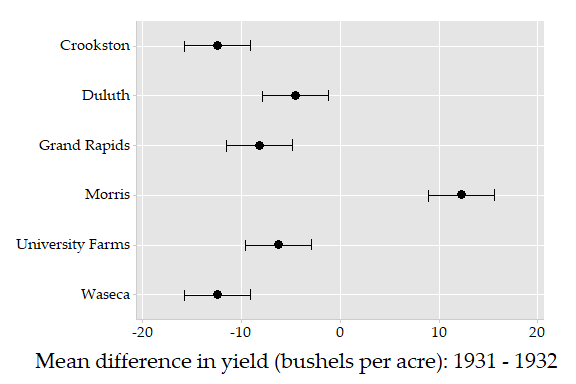
Here is a graph of the mean difference in yields (1931-1932), according to site. The bars are 95% confidence intervals.
The data are from: Cleveland WS. (1993) Visualizing Data, Hobart Press, Summit, NJ.
The original experiment is reported in: Immer RF, Hayes HK and Powers L. (1934) Statistical Determination of Barley Varietal Adaptation, Journal of the American Society of Agronomy,
26, 403–419.
The next plot is an interaction style plot. It shows the rate of homeless per 10,000 population in Australian states and territories, for two groups, estimated from census data collected from 2006 to 2016. (Data for the “Not stated” group are not included in the plot below.) The data are taken from: Australian Bureau of Statistics publication 2049.0 – Census of Population and Housing: Estimating homelessness, 2016.
